Matthew's Room: good to great!
/For my very first One Room Challenge earlier this spring I worked with my favourite client yet, my daughter Lily. She absolutely loved her room as did my son Matthew, so much so, that he asked for his own room refresh!
I thought his room looked great as-is! We had already painted his walls a gorgeous deep blue called "Drawing Room Blue" by Farrow & Ball, customized some white IKEA curtains with navy ribbon, framed and hung some of his own artwork and a moravian star light.
matthew's Room - Before
After seeing Lily's room, Matthew's ideas for improvements included:
- bright colours
- a desk
- a "king" bed with one of those "things" (he thought Lily's new daybed with bolsters looked like a bed fit for a queen)
We worked on this design plan plan together which is very similar to his original room with a few tweaks:
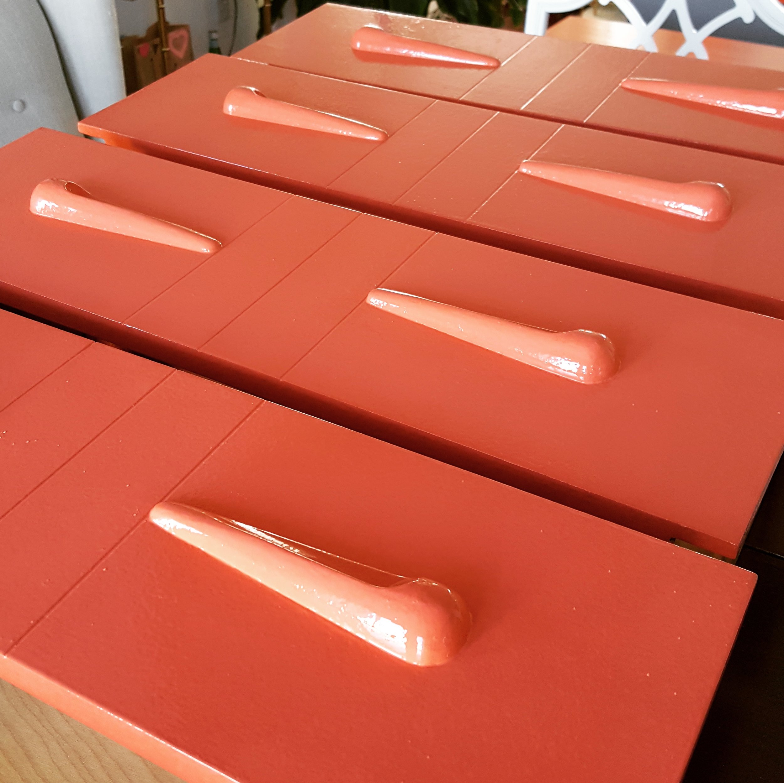
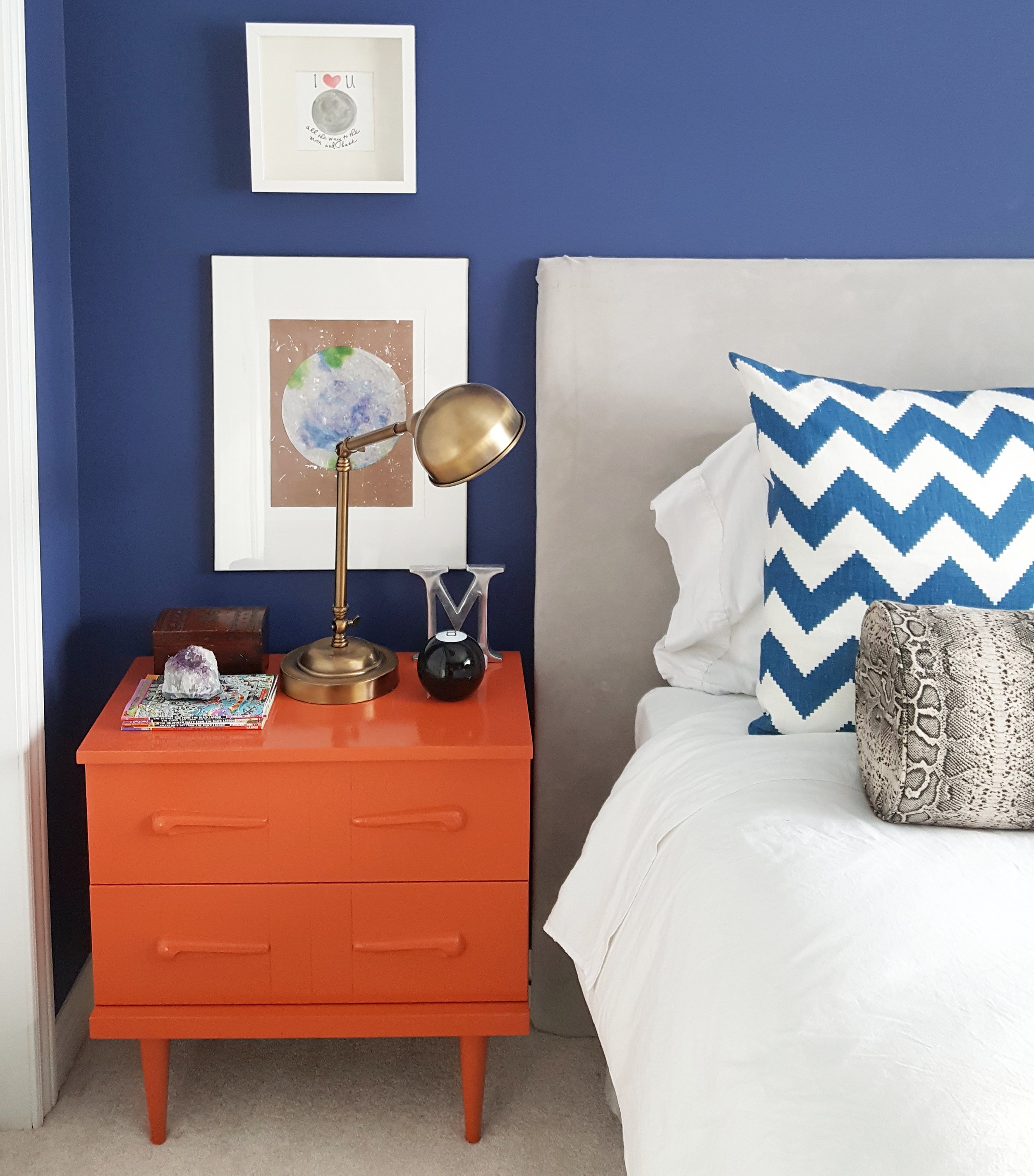
First up, adding some bright colour! I've always wanted to use Farrow & Ball's "Charlotte's Locks" and now was my chance. Matthew loved it and went to work right away painting his bedside tables.
Farrow & Ball's "Charlotte's Locks"
matthew - painting helper
Now for a desk. I searched high and low for a desk and chair and on my favourite site Kijiji but wasn't able to find the right one. I was downtown Orillia one afternoon and went into a newly opened thrift shop and found a little desk in great condition with similar wood tone as Matthew's art deco dresser for only $50 - SOLD!
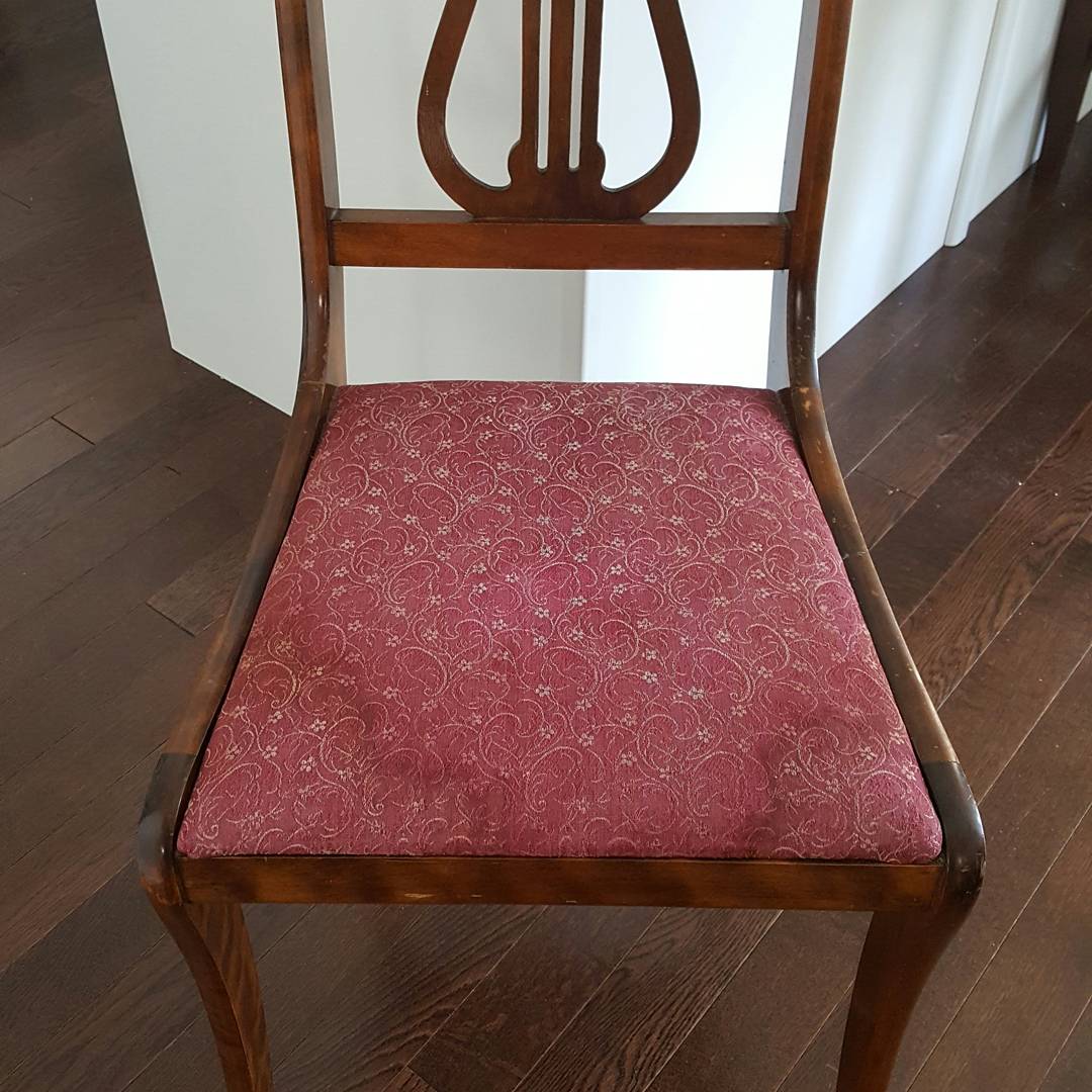
Matthew's chair was also a lucky find thanks to a quick trip to the Salvation Army, one of my regular haunts. At only $5.00, it was the perfect size, shape, wood tone and just needed a new seat - another DIY for Matthew!
Matthew's Chair - before
Together we took a remnant of Caitlin Wilson's Navy Burnside Buffalo Check coated canvas that we used to redesign our dining chairs, added some extra foam, batting and made it as good as new.
Just one more thing to take Matthew's room to the next level - a bolster. My Mom had an outdoor bolster from IKEA that she wasn't using anymore which was just the right size for Matthew's bed. I asked him what kind of fabric he would like for it and he said "Pokemon". I went to our Orillia Fabricland and I'm not going to lie ... I wasn't sad when I couldn't find any Pokemon fabric. I brought home a sample of fabric that looked like snake skin which I thought was pretty cool and luckily so did Matthew. Rick's upholstery made a slipcover for it so I could remove it to wash it.
Althought it wasn't on Matthew's wish list, I wanted to get him some new art just like I did for Lily in addition to his Marlene Bulas original birch tree painting and a few space shuttle pictures that my Dad gave him. Jenny's Print Shop shared one of their new additions called "Luna" and James Pauk Photography printed an enlarged copy for an IKEA frame.
"luna" from Jenny's Print shop
Matthew loves everything about his room and he was absolutely right - it need a few bold moves to take it to the next level.
- Carley
