Fall 2018 One Room Challenge - Week 6: Big Girl & Baby Boy Reveal!
/“It takes a village to raise a child” and in the case of our One Room Challenge we quickly learned that it takes a village to complete two rooms for two beautiful children - my niece Audrey May and nephew Clark Douglas.
Audrey’s “Big Girl” Room
Clark’s Nursery
My brother Paul from Brancon not only took these two rooms back to the studs and completely changed the framing and resulting layout, but also brought these to the finish line with moulding, fixtures and paint. Paul worked around nap times and literally around the clock to make these rooms happen and was also the key decision maker on all of the final touches. I am so grateful for his ideas, problem solving and talent and couldn’t have done it without him.
We also had a lot of help from our family:
my best friend Sandra and her Mom (and my second Mom since I was 14) Pam who helped polish hardware and move dressers late at night
my Dad Doug (Clark’s namesake) who made several trips with laundry baskets full of accessories between our homes and looked after my munchkins until the wee hours of the morning so I could finish styling for early morning photo shoots
my sister-from-another-mister Kristy for all of the last minute organizing and cleaning as well as being so flexible with the two littles so we could finish the space
my Mom, our cousin Kelly, my sister Erin and my two children Matthew and Lily for providing furniture and accessories to complete both spaces
This is my fourth One Room Challenge after starting my blog last spring and participating in the 2017 Spring, 2017 Fall and 2018 Spring challenges. For all other challenges I chose to design and feature spaces in our own home. This time I not only ventured outside our home but took on two spaces at the same time! At three years old, it was time for Audrey to move out of her crib into a big girl bed and at eight months old it was time for Clark to move into room of his own. There was no way I could choose between Audrey and Clark and it was important for these tiny people to have their own unique spaces that they could grow into.
Design Direction
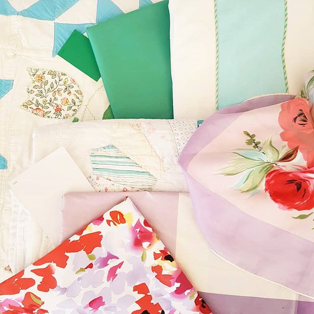
This fabric scheme was the jumping off point for both rooms and allowed me to work with pieces that they already had starting with drapery. Take a look at progress for both rooms throughout the challenge during Week 1, Week 2, Week 3, Weeks 4 & 5 for all the details.
Audrey’s Room
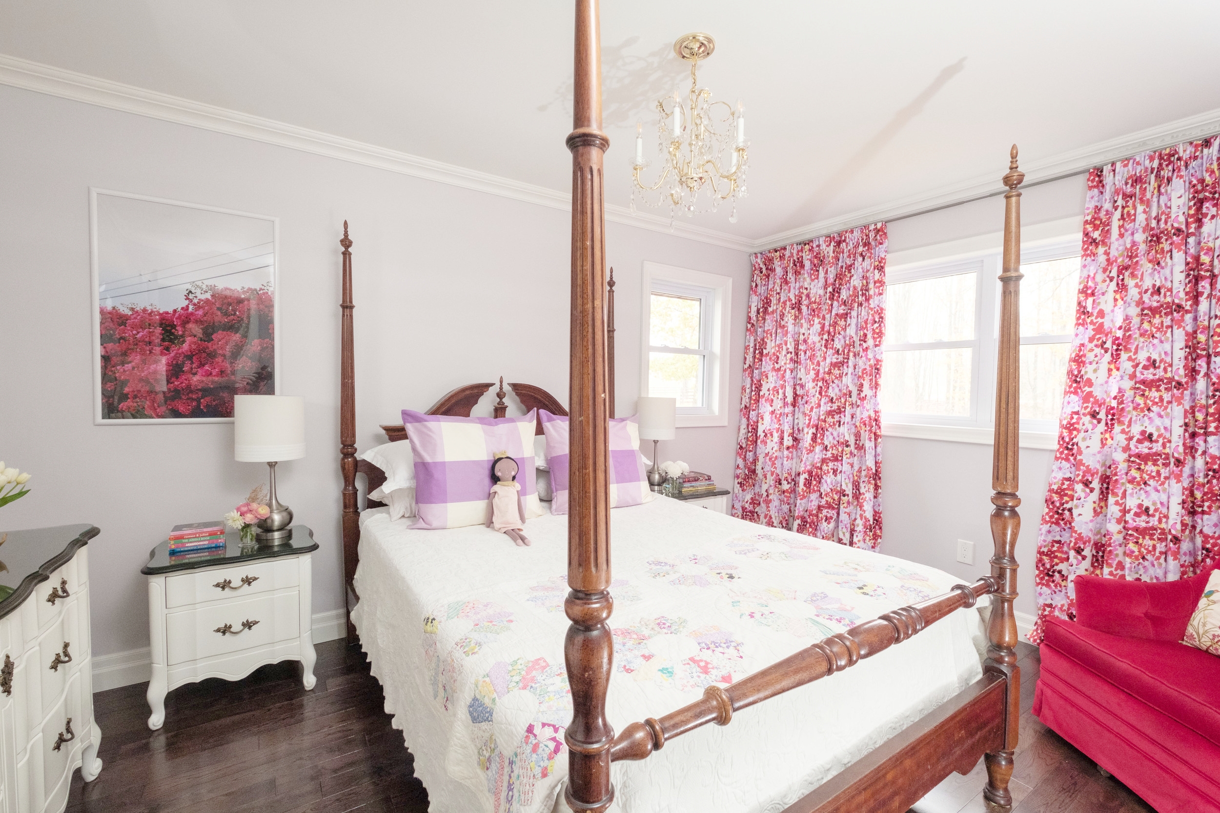
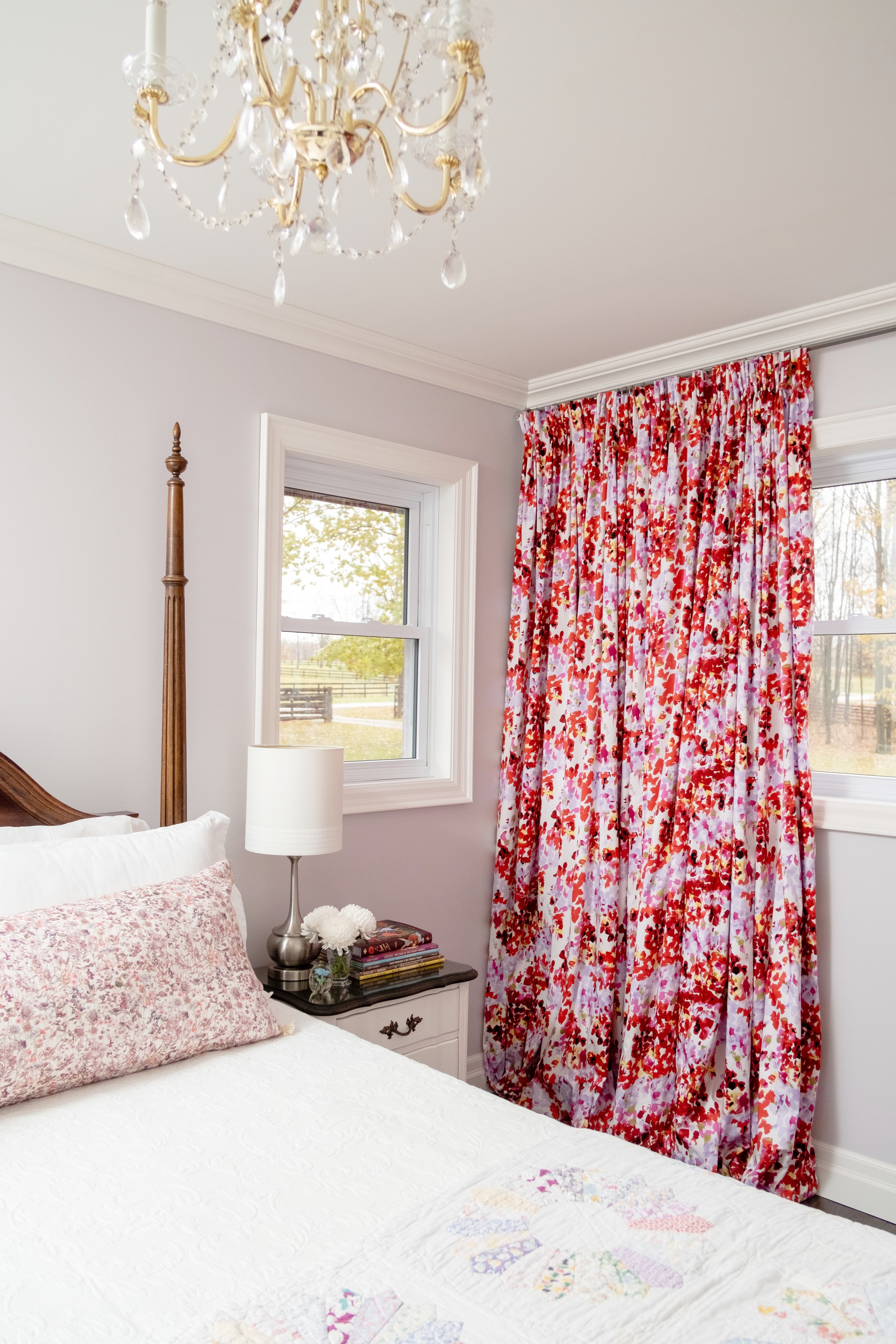
We pulled together fabrics, furniture, lighting and accessories that we already had, collected from thrift stores, family and friends and used that as a base for our design featuring a beautiful four post bed from our cousin Kelly.
I made the pinch pleated drapes from dressmakers fabric that I found years ago, completely buying out all available yardage at Fabricland in two cities because I loved it so much. After Audrey was born I saw the red velvet chair at our Orillia Restore and immediately sent Paul and Kristy a text saying “What do you think about this chair? I think I could make it work with that fabric for Audrey’s room”. Neither one could picture it and they likely both thought I was crazy at the time.
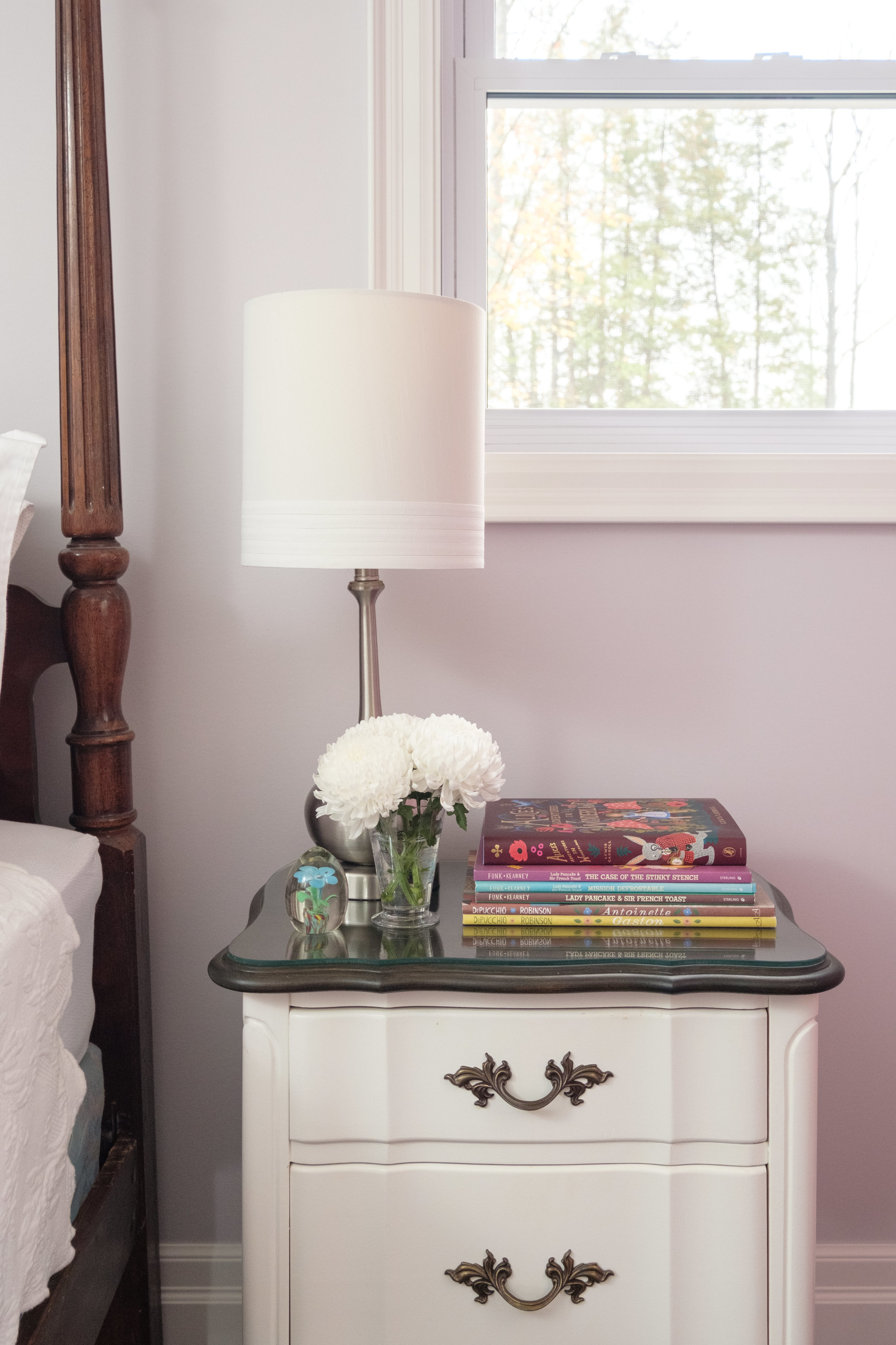
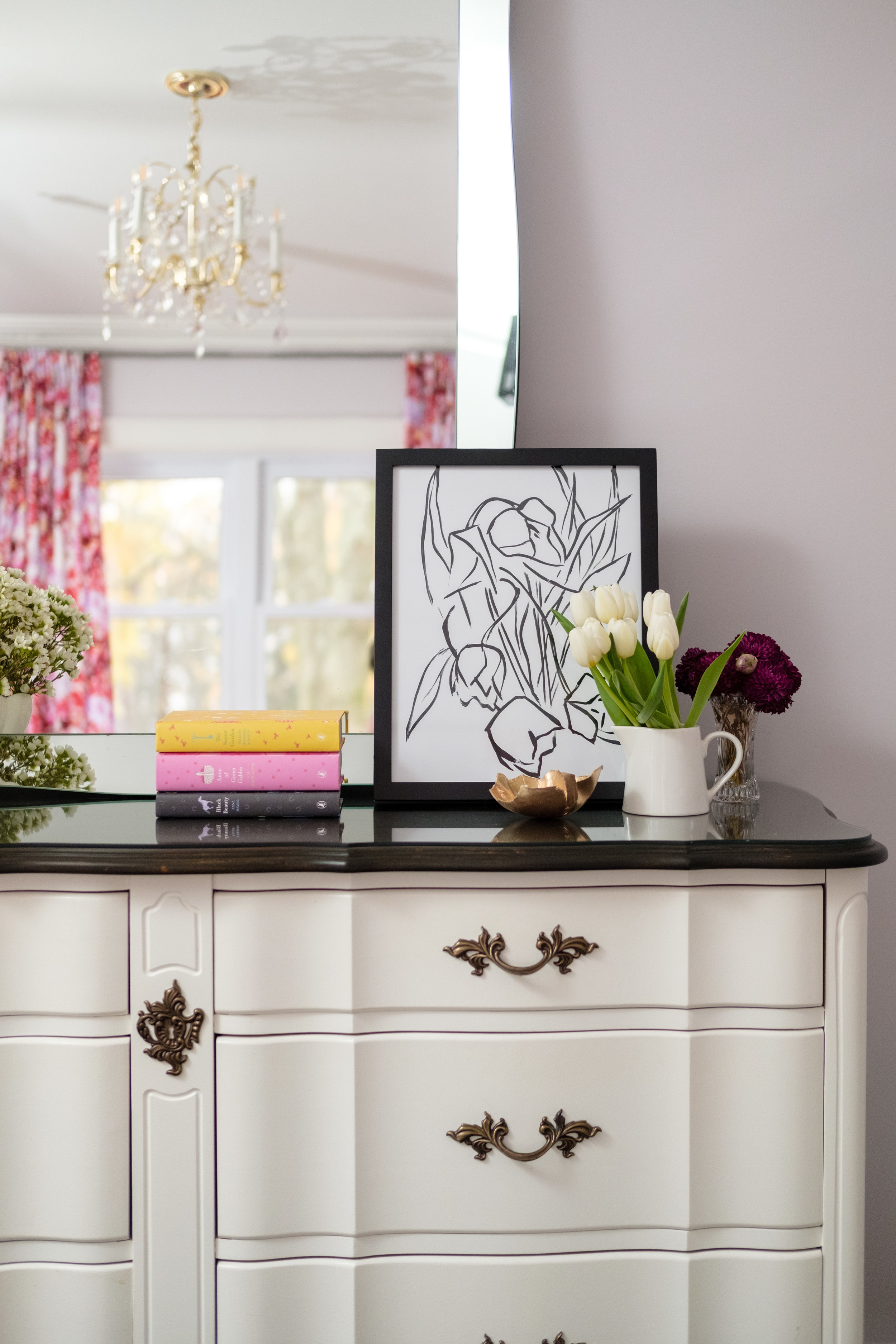
Both are pretty bossy (the drapery fabric and chair, not Paul and Kristy) so I was careful to have everything else in the room compliment the colours but ensure that the backdrop was quiet. We painted the room a soft custom lavender colour, dressers in Benjamin Moore’s “Cloud White” and kept the bedding calm and white except for an antique quilt from Christie Antique and Vintage Show that my Mom and I found years ago. We brought the lavender to the bed as an accent with two buffalo check euro shams that I made and a beautiful small floral lumbar by Juniper Studio for two different yet similar looks.
To balance the drapes on the other side of the room as well as the smaller window we hung a print from Jenny’s Print Shop called “Bougie” at the same height of the window. This provided the symmetry we needed, almost making it appear like a second small widow.
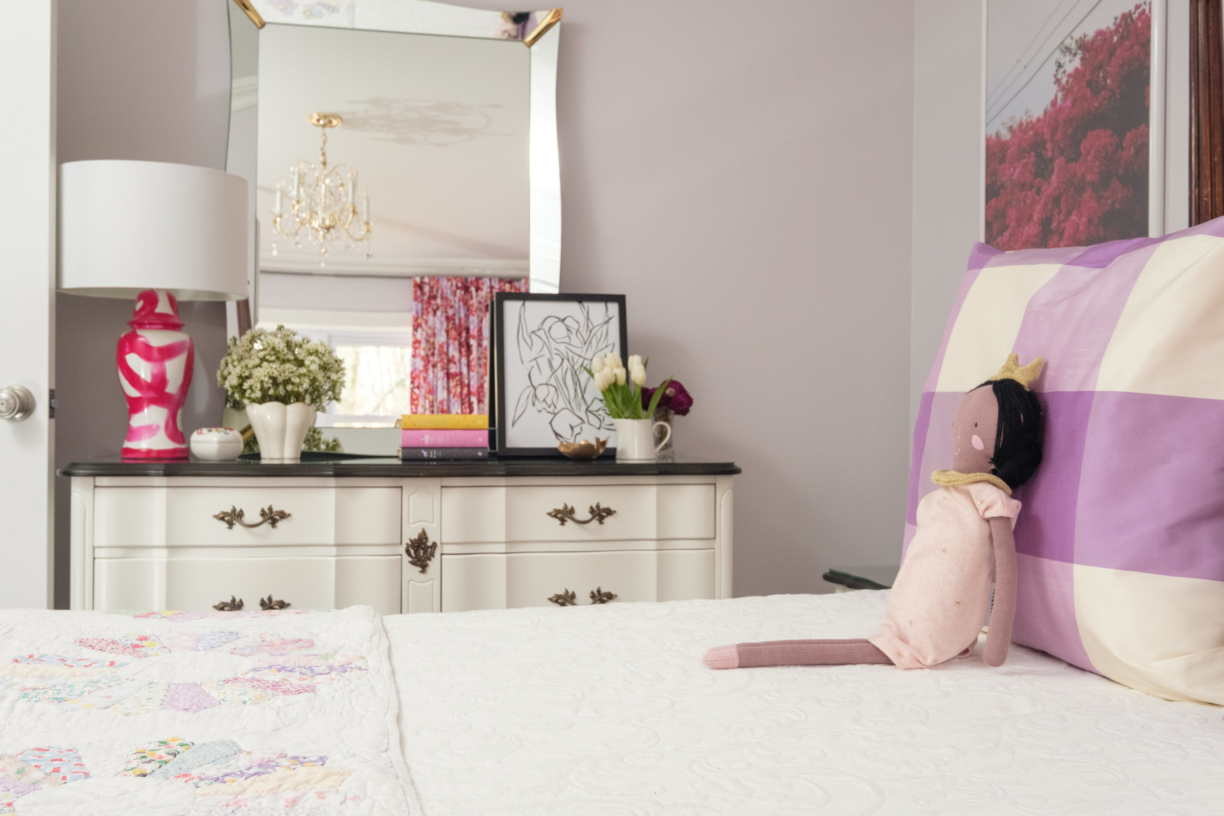
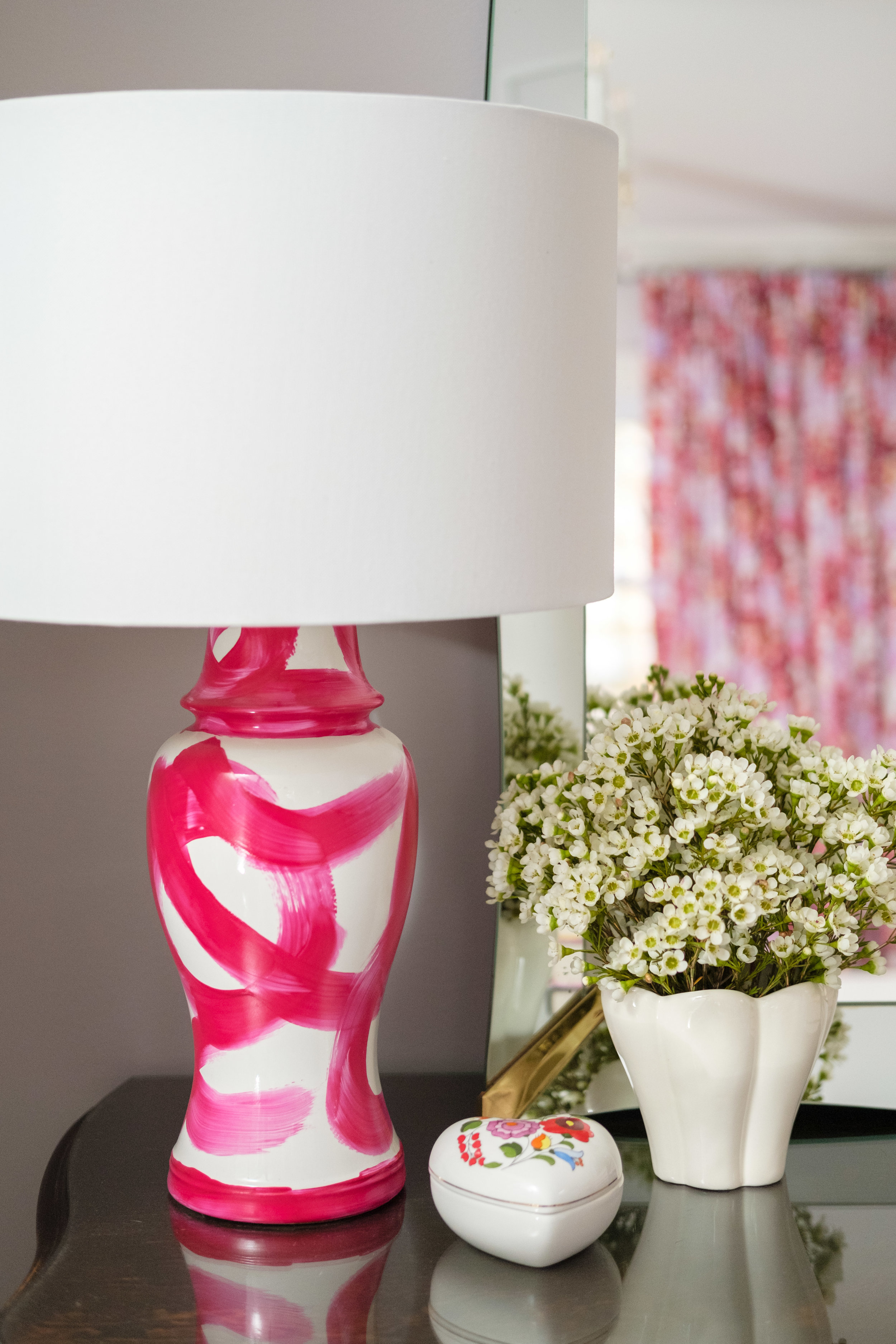
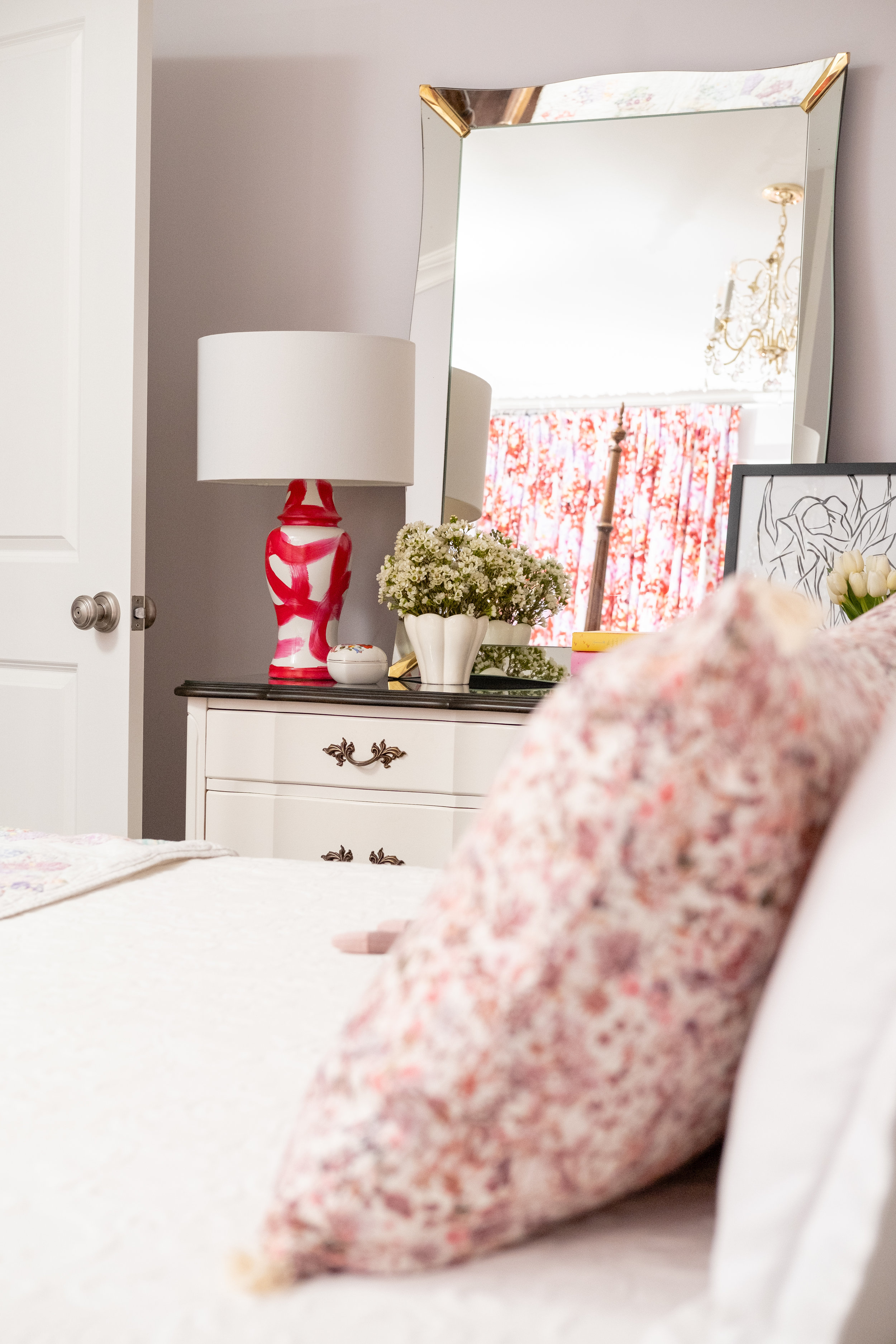
To balance the red velvet chair I drew inspiration from brushstroke lamps from Bunny Williams and ginger jars by Jana Bek and painted a ginger jar shaped lamp I found at our Orillia Habitat for Humanity Restore. It’s bold, fun and was an easy DIY for this space.
Audrey May is named after my Grannie Audrey and my Great Aunt May so it was important to add some vintage and antique touches to the space as a nod to both of them. We layered vintage pottery, an antique mirror and flowers to soften everything. Audrey has always been obsessed with ceiling lights that sparkle and this vintage chandelier that I found for $10 at a garage sale this past summer was the perfect final touch.
Clark’s Room
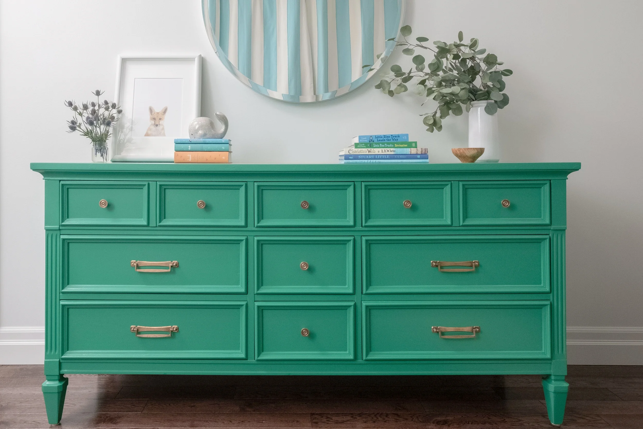
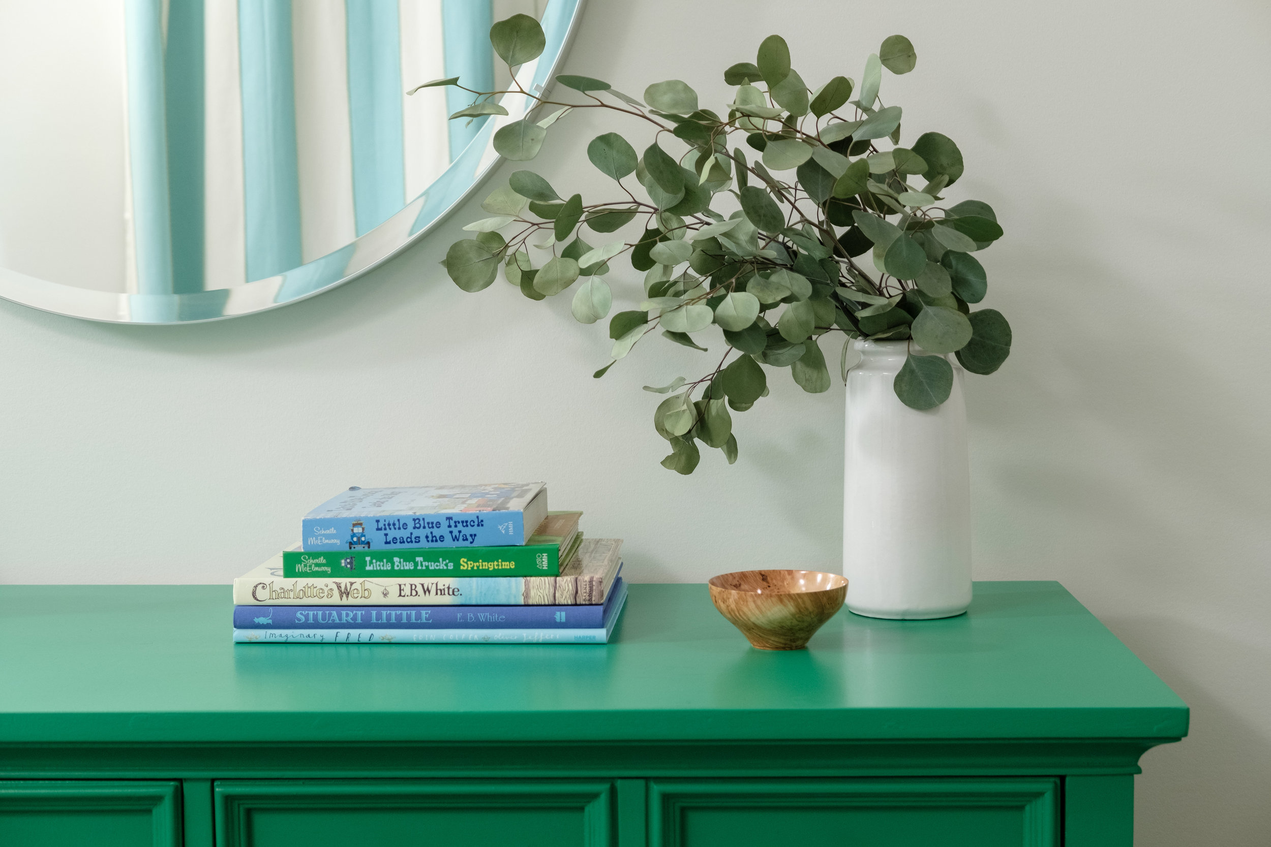
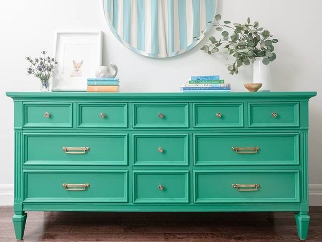
For Clark’s room we took a similar approach to design but went in a completely different colour direction. Instead of warm red, fuschia pink and lavender as in Audrey’s room we went with cool blue, green and cream. The entire space was painted in Benjamin Moore’s “Cloud White” which provided a neutral backdrop for another pair of bossy drapes (blue and white cabana stripes) and another bossy piece of furniture, a green dresser/change table painted in Sherwin Williams’ “Argyle”.
We used a crib that was given to Paul and Kristy from friends and I had the drapes and wing chair in storage from my son Matthew’s nursery years before. I found the quilt at the Christie Antique & Vintage show the same time my Mom and I found the quilt in Audrey’s room which adds a little bit of colour and softness to the room.
We took inspiration from the natural surroundings for art and found some great prints from Jenny’s Print Shop including “Cottonwood”, a large tree picture and “Hills” by Lynne Millar. The cheeky Highland steer print is a nod to a nearby farm that has a herd of Highland cattle which the family slows down to see on their drive home so Audrey can say “Mooooooooooo” as she does with the cows on our family farm.
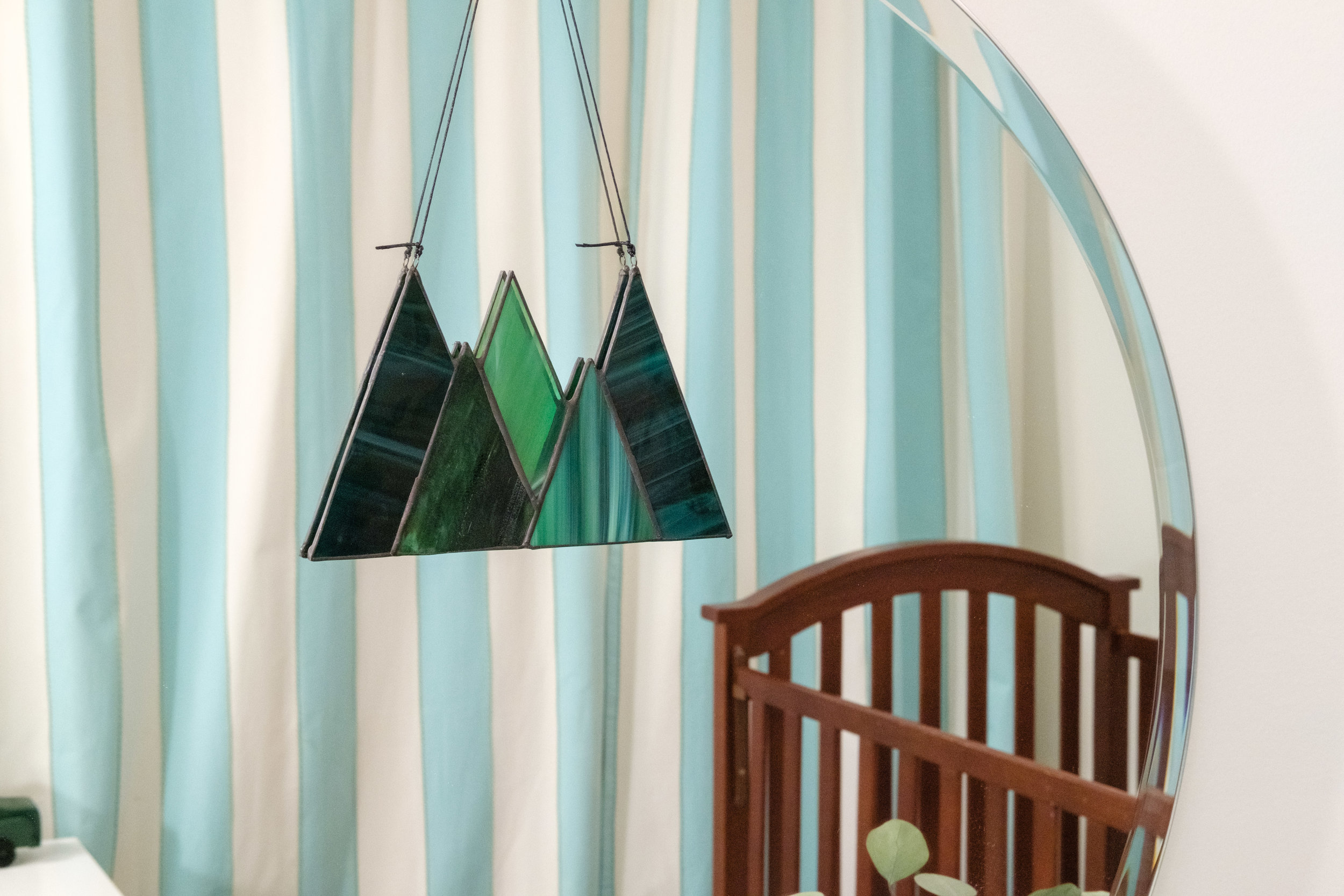
Pooling our resources allowed us to invest in a few handmade heirloom pieces by local makers including a forest mobile made from different types of wood by Libra Woodworks, a stained glass piece hanging on the mirror by Flux Glass Co. in Orillia through Harold & Ferne and a beautiful burl wood bowl by John Head.
Both spaces were so fun to design and are the first completely finished rooms in Paul and Kristy’s home as they rebuild it from top to bottom. I’m crossing my fingers that I may be invited back to finish another room - maybe even for an upcoming One Room Challenge!
Thank you Lynda from Calling it Home for organizing this event again and for Better Homes and Gardens for supporting as media sponsor. Please take a look at final reveals from both featured designers and guest participants - they are so good!
Carley
Source Guide:
Audrey’s Room: dresser, end tables, chandelier, vintage pottery found at garage sales and thrift stores; “Tulips” black and white print by Lynne Millar and large floral “Bougie” print, Jenny’s Print Shop; fawn & lynx prints, Indigo; black frame and large white poster frame, Michaels; smaller white frames, IKEA; flowers, Mid-Valley Gardens; quilt, Christie Antique & Vintage Show; books, Manticore Books, Amazon, Indigo; red velvet chair, Orillia Habitat for Humanity Restore; lamps, bed, coverlet, client’s own; mirror, Kijiji; small lumbar on rocker, Pier One; large lumbar on bed, Juniper Studio; doll on bed, Homesense; painting, carpentry, Paul Brandon of Brancon; brushstroke ginger jar lamp, pinch pleated drapes, buffalo check euro shams, gold clay trinket holder, floral arrangements, Carley Brandon Designs; photography, Rowell Photography.
Clark’s Room: dresser, Kijiji; bookcase, IKEA; chair, crib, sheepskin rug, drapes, crib blanket, client’s own; fox print, whale bank, Indigo; “Cottonwood” tree print and “Hills” print by Lynne Millar, Jenny’s Print Shop; Hyland steer print, fox stuffed animal, Homesense; dresser colour Sherwin Williams “Argyle”; wall colour, Benjamin Moore “Cloud White”; paint, Home Hardware; burl wood bowl, John Head; quilt, Christie Antique & Vintage Show; books, Manticore Books, Amazon, Indigo; vintage pottery (tall white vase & green/blue pod vase), vintage tree lamp, Value Village; wooden tree mobile, Libra Woodworks; stained glass trees, Flux Glass Co. via Harold & Ferne; painting, carpentry, Paul Brandon of Brancon; dresser refinishing, pillow in crib with mother of pearl buttons, floral arrangements, Carley Brandon Designs; photography, Rowell Photography.


