Fall 2019 One Room Challenge - Week 2: Design Direction
/Design Direction
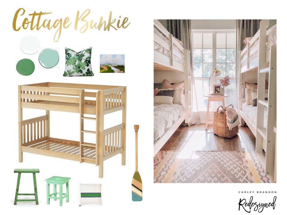
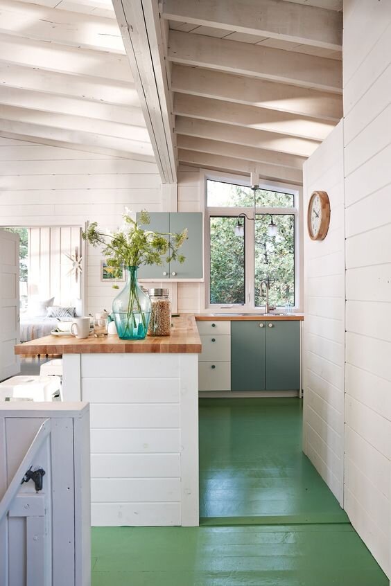
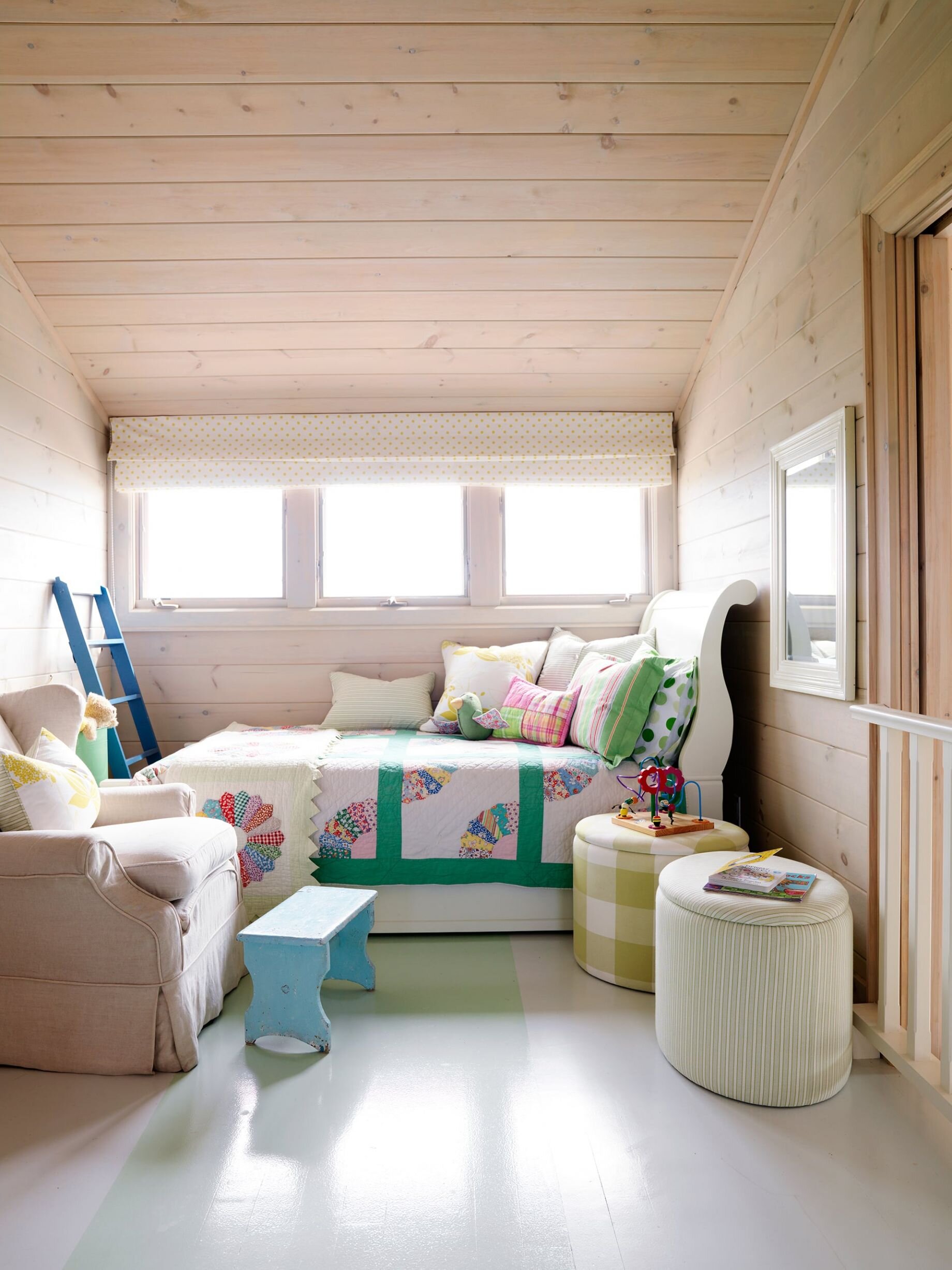
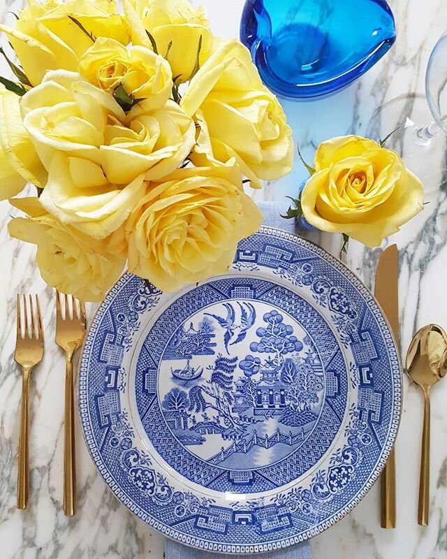
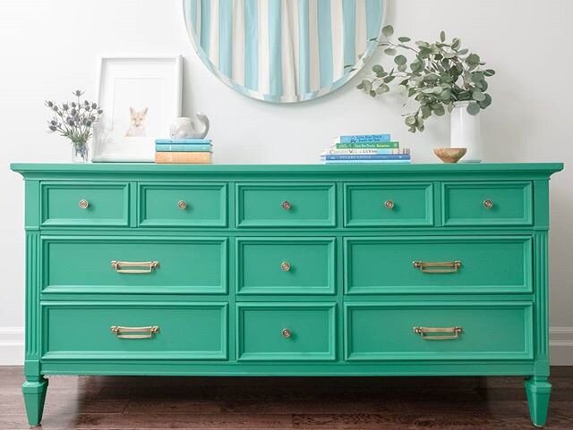
It’s Week 2 of the Better Homes and Gardens One Room Challenge and I’m sharing the design direction for our Cottage Bunkie - both inside and out! Since our main cottage and bunkie sit right beside the Green River, I thought it only fitting to decorate the bunkie with shades of green. Here is my overall design direction for the interior of the bunkie followed by a few inspirational images from Canadian designer and cottage owner Sarah Richardson as well as others:
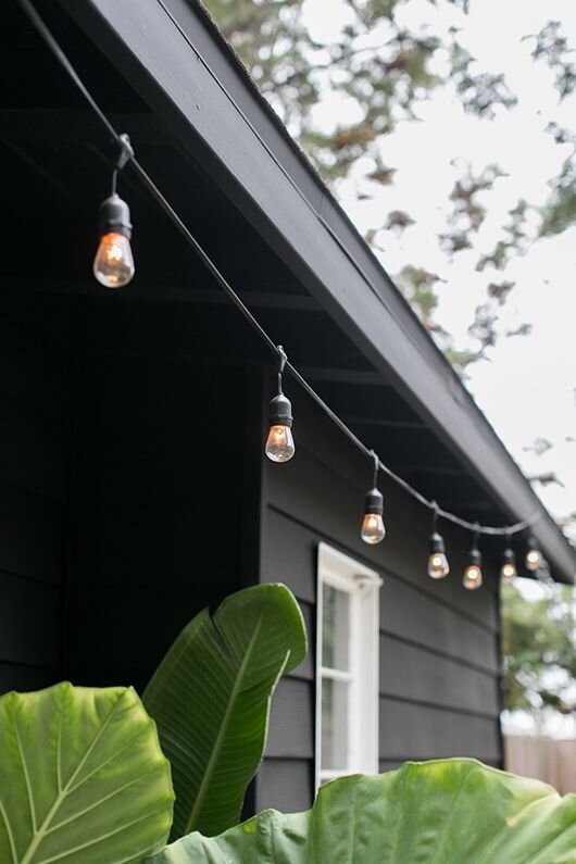
When renovating the main cottage a few years ago we went with a high contrast exterior with white windows and trim and dark siding. I wasn’t quite able to talk my family into black but I did talk them into a dark gray called “Wrought Iron” by Benjamin Moore. Because the bunkie and the main cottage are right beside each other, we’re going to paint the bunkie the same colour.
Making Progress
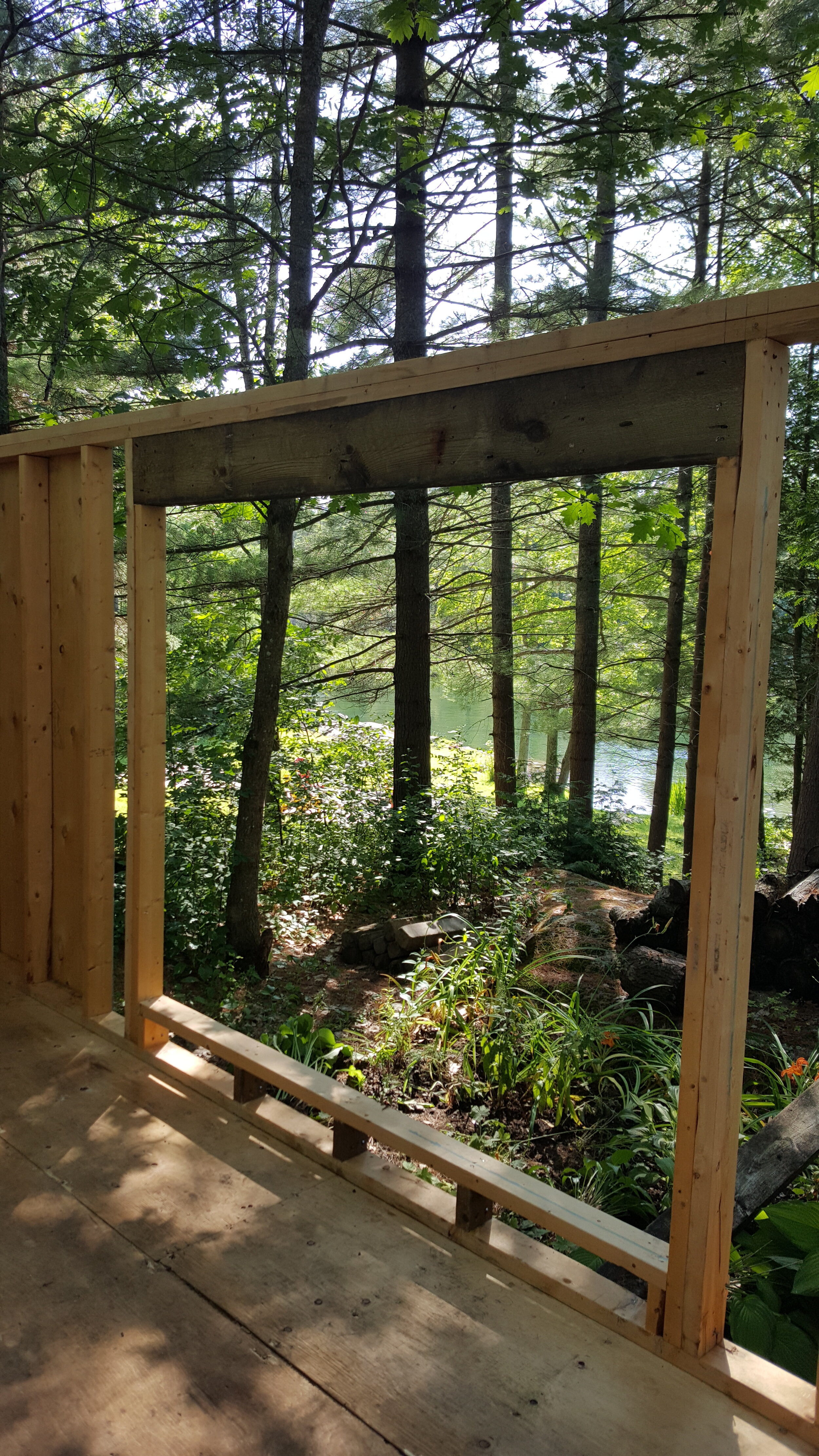
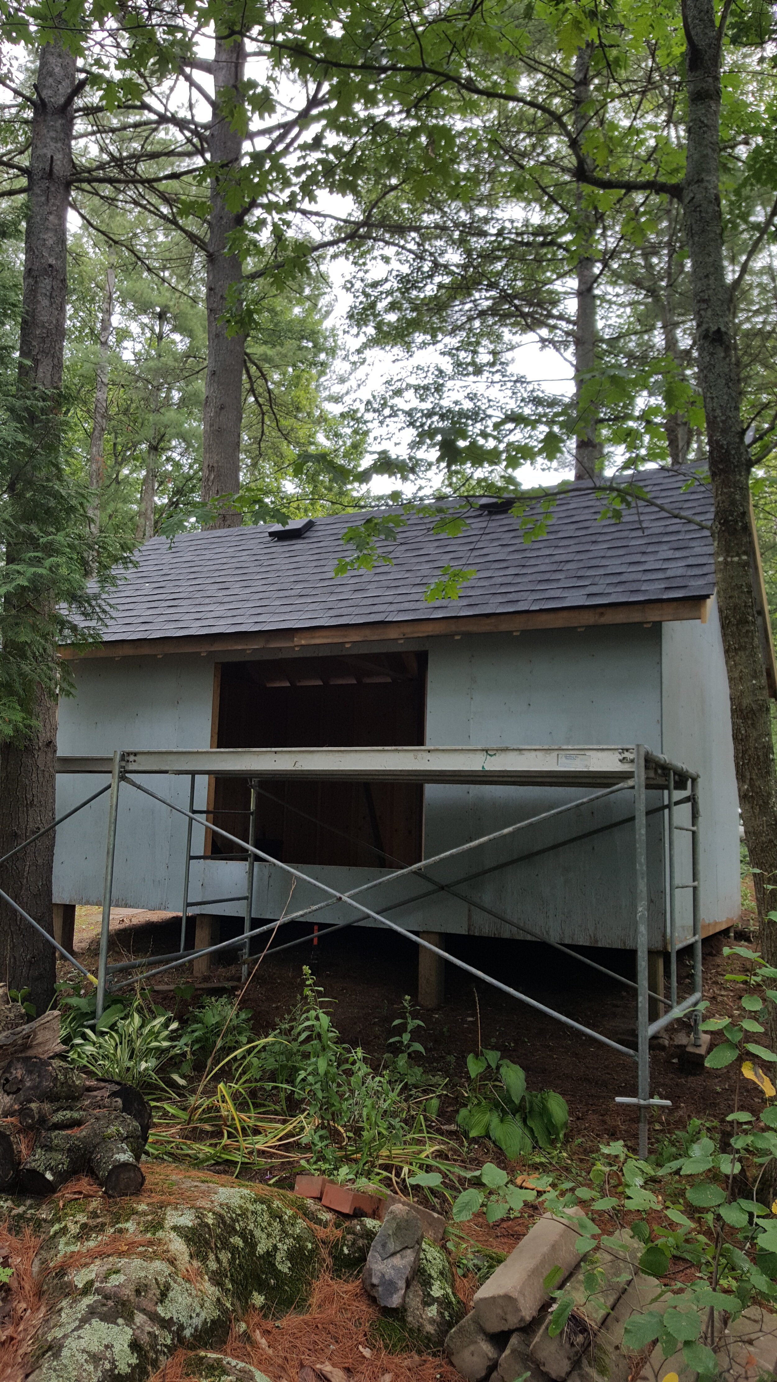
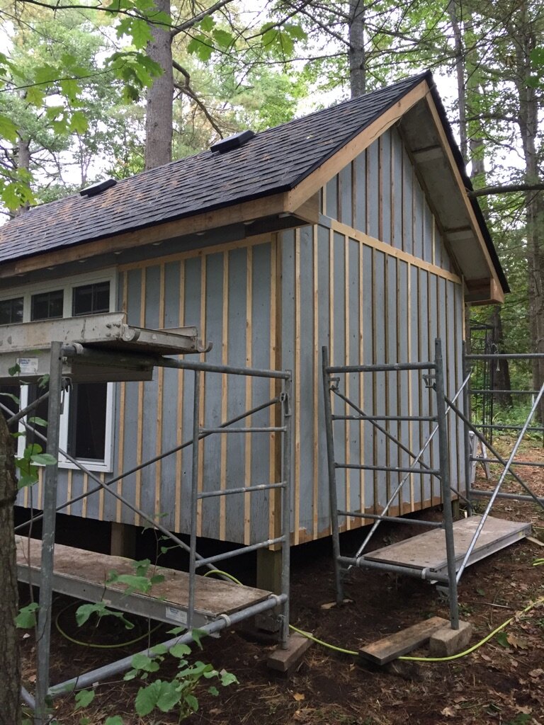
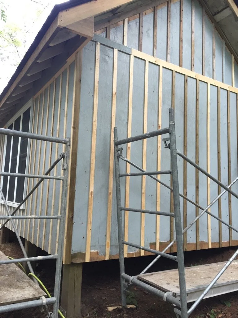
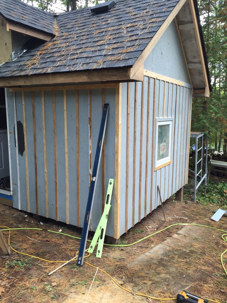
Just as the weather quickly changed from summer heat to cool fall over the past week, our cottage bunkie is quickly changing too! Our Week 1 post showed the bunkie starting to take shape. This week, my brother Paul has been working on site installing the roof, windows and wood strips to make the siding look like board and batten.
We’re hoping that the weather stays just warm enough to paint the interior and exterior over the next week and then we can really get started on putting the space together. Right now I’m on the hunt for a few special antique pieces, a lantern style light and most importantly bunk beds! There is so much to do but I think we’re going to make it happen in the next 3 weeks! Let’s do this!
Carley

